Rule of Thirds Layout
The artists of the Renaissance used divine proportion to design their paintings, sculpture, and architecture, and designers today often employ this ratio when creating page layouts, posters, and brochures. Rather than relying on artistic notion, divine proportion gives us logical guidelines for producing appealing layouts. The Pythagoreans observed a mathematical pattern that occurred so often in nature that they believed it to be divinely inspired. They referred to this pattern as the golden ratio or divine proportion.
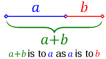
Φ (pronounced phi) is the symbol for the golden number. To three significant figures it is 1.62, but it is an irrational number is 1.6180339 (unnecessary presicion for our purposes!) The Rule of Thirds is a simplified version of the golden ratio. A line bisected by the golden ratio is divided into two sections, one of which is approximately twice the size of the other. Therefore dividing your page into thirds is an easy way to apply divine proportion without getting out your calculator. It doesn't matter which part is the larger (left or right). Similarly, when creating a graphic the width should be roughly 1.5 times the height or vice versa.
|
|

Custom Search
 To achieve a beautiful page layout you need to look to rules followed by artists in the layout of their compositions or works of art. Compositions divided by lines that are proportionate to the golden ratio are considered to be aesthetically pleasing.
 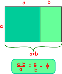 See the diagram on the right - it shows how the number is worked out... but the maths is beyond the scope of a computing course - you just need to know about it.